Thursday, July 31, 2025 | 8 min read
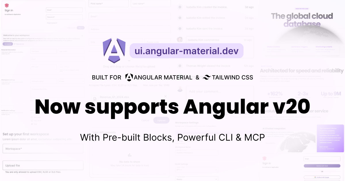
Angular Material Blocks now supports Angular v20!
Angular Material Blocks has successfully migrated to Angular v20 with signals migration, updated button directives, and enhanced CLI support - now featuring 180+ blocks with backward compatibility for Angular v19.
Posted by
 Dharmen Shah @shhdharmen
 It has been almost 3 months since we [announced](https://x.com/shhdharmen/status/1908951789744927060) the _Angular Material Blocks_ project. On launch, we started with 100+ blocks, a traditional way of allowing developers to copy/paste the codes & an intuitive CLI which handles everything for devs. Try running `npx @ngm-dev/cli init` in your existing Angular project and then add a sample login form with command `npx @ngm-dev/cli add free-authentication/login-email-password`, [read more about CLI here](/docs/cli-setup). If you are not ready to try in existing project, we also have a [sample project ready on GitHub](https://github.com/shhdharmen/ngm-dev-blocks-demo-app) for you to try out!
Since launch, we have added 80+ blocks. We have also added an [MCP server](/docs/mcp) to the project, which allows developers to add blocks just by having a chat in their AI based IDE. We are confident that this has helped developers to build their applications faster.
 And we are just getting started! With our latest release, we are now supporting Angular v20. Thanks to Angular team, there were not lot of breaking changes compared to Angular Material v19, hence, we were able to easily migrate all of our blocks to Angular Material v20.
## Highlights
- Applied [signals migration](https://github.com/angular/angular/tree/main/packages/core/schematics/ng-generate/signals#combined-signals-migration), [self closing tags migration](https://angular.dev/reference/migrations/self-closing-tags) & [control flow syntax migration](https://angular.dev/reference/migrations/control-flow) to all the blocks
- Updated all blocks to Angular v20
- Replaced `--mdc-outlined-card-container-shape` with `--mat-card-outlined-container-shape` in the tailwind css theme config file. This is to align with the latest change in [tokens' names](https://github.com/angular/components/pull/31051) in Angular Material
- Updated [Angular Material Buttons](https://material.angular.dev/components/button/overview) in all blocks to use new directives' patterns:
- `mat-button` changed to `matButton`
- `mat-raised-button` changed to `matButton="elevated"`
- `mat-flat-button` changed to `matButton="filled"`
- `mat-stroked-button` changed to `matButton="outlined"`
- Added [llms.txt](https://ui.angular-material.dev/llms.txt) that will help large language models discover the latest Angular Material Blocks documentation and code samples
- **Breaking Change**
- For MCP, now developers will need to give full path to their Angular project in `mcp.json` file. [Learn more](/docs/mcp#installation)
## How to upgrade?
First of all, you need to update your Angular project to Angular v20. You can do this by running the following command:
```bash
ng update @angular/core @angular/cli @angular/material
```
Once you have updated your Angular project, you can update your Angular Material Blocks project by running the following command:
```bash
npx @ngm-dev/cli update
```
This will update all the blocks to Angular v20.
## What about file name convention?
With Angular v20, the Angular team made filename and class name suffixes optional to encourage more intentional naming of the abstractions which reduces boilerplate.
But, Angular Material Blocks still uses the old file name style convention. The primary reason is keeping the code consistent with the old version of Angular Material Blocks.
If you are using new Angular project created using Angular CLI v20 and want to use old file name style convention, you can do so by updating your `angular.json` using following configuration:
```json
{
"projects": {
"app": {
...
"schematics": {
"@schematics/angular:component": { "type": "component" },
"@schematics/angular:directive": { "type": "directive" },
"@schematics/angular:service": { "type": "service" },
"@schematics/angular:guard": { "typeSeparator": "." },
"@schematics/angular:interceptor": { "typeSeparator": "." },
"@schematics/angular:module": { "typeSeparator": "." },
"@schematics/angular:pipe": { "typeSeparator": "." },
"@schematics/angular:resolver": { "typeSeparator": "." }
},
...
}
```
## What about Angular v19?
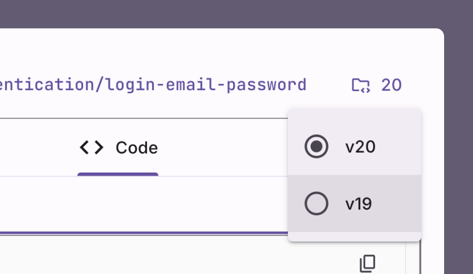
As of **today (31st July, 2025)**, all the blocks are compatible with Angular v19. If you are using [CLI](/docs/cli-setup) or [MCP](/docs/mcp), then they will take care of the version for you, you don't have to do anything extra, just make sure that it's [updated to latest version](https://www.npmjs.com/package/@ngm-dev/cli). On web, over the "Code" tab of any block you’ll now find a picker to toggle between v20 and v19.
And we are just getting started! With our latest release, we are now supporting Angular v20. Thanks to Angular team, there were not lot of breaking changes compared to Angular Material v19, hence, we were able to easily migrate all of our blocks to Angular Material v20.
## Highlights
- Applied [signals migration](https://github.com/angular/angular/tree/main/packages/core/schematics/ng-generate/signals#combined-signals-migration), [self closing tags migration](https://angular.dev/reference/migrations/self-closing-tags) & [control flow syntax migration](https://angular.dev/reference/migrations/control-flow) to all the blocks
- Updated all blocks to Angular v20
- Replaced `--mdc-outlined-card-container-shape` with `--mat-card-outlined-container-shape` in the tailwind css theme config file. This is to align with the latest change in [tokens' names](https://github.com/angular/components/pull/31051) in Angular Material
- Updated [Angular Material Buttons](https://material.angular.dev/components/button/overview) in all blocks to use new directives' patterns:
- `mat-button` changed to `matButton`
- `mat-raised-button` changed to `matButton="elevated"`
- `mat-flat-button` changed to `matButton="filled"`
- `mat-stroked-button` changed to `matButton="outlined"`
- Added [llms.txt](https://ui.angular-material.dev/llms.txt) that will help large language models discover the latest Angular Material Blocks documentation and code samples
- **Breaking Change**
- For MCP, now developers will need to give full path to their Angular project in `mcp.json` file. [Learn more](/docs/mcp#installation)
## How to upgrade?
First of all, you need to update your Angular project to Angular v20. You can do this by running the following command:
```bash
ng update @angular/core @angular/cli @angular/material
```
Once you have updated your Angular project, you can update your Angular Material Blocks project by running the following command:
```bash
npx @ngm-dev/cli update
```
This will update all the blocks to Angular v20.
## What about file name convention?
With Angular v20, the Angular team made filename and class name suffixes optional to encourage more intentional naming of the abstractions which reduces boilerplate.
But, Angular Material Blocks still uses the old file name style convention. The primary reason is keeping the code consistent with the old version of Angular Material Blocks.
If you are using new Angular project created using Angular CLI v20 and want to use old file name style convention, you can do so by updating your `angular.json` using following configuration:
```json
{
"projects": {
"app": {
...
"schematics": {
"@schematics/angular:component": { "type": "component" },
"@schematics/angular:directive": { "type": "directive" },
"@schematics/angular:service": { "type": "service" },
"@schematics/angular:guard": { "typeSeparator": "." },
"@schematics/angular:interceptor": { "typeSeparator": "." },
"@schematics/angular:module": { "typeSeparator": "." },
"@schematics/angular:pipe": { "typeSeparator": "." },
"@schematics/angular:resolver": { "typeSeparator": "." }
},
...
}
```
## What about Angular v19?
As of **today (31st July, 2025)**, all the blocks are compatible with Angular v19. If you are using [CLI](/docs/cli-setup) or [MCP](/docs/mcp), then they will take care of the version for you, you don't have to do anything extra, just make sure that it's [updated to latest version](https://www.npmjs.com/package/@ngm-dev/cli). On web, over the "Code" tab of any block you’ll now find a picker to toggle between v20 and v19.
 While we are going to support Angular v19 with our best efforts, we do not guarantee that new blocks will work with Angular v19. But, as we mentioned earlier, the breaking changes are minimal, so if even if any block is not supported for Angular v19, you should be able to manually update the code to make it work.
### How you are going to support Angular v19?
We have created a migration tool using [NX generator](https://nx.dev/extending-nx/recipes/local-generators), which will help us to generate Angular v19 compatible blocks' codes when we generate builds. This will help us to support Angular v19 for a long time. To give you an idea, below is the list of migrations we apply when converting a block from Angular v20 to v19:
```typescript
const htmlMigrations: HTMLMigration[] = [
{
name: 'Angular Material Button Directives',
description:
'This migration will replace new Angular Material Button directives with the old ones.',
files: FILE_PATTERNS.HTML,
replacements: [
// Process specific button types first, then generic matButton
// Order matters: specific patterns must come before generic ones
{
pattern: /(<[^>]*\s)matButton="elevated"(\s|>)/g,
replacement: '$1mat-raised-button$2',
},
{
pattern: /(<[^>]*\s)matButton="tonal"(\s|>)/g,
replacement: '$1mat-flat-button$2',
classList: {
add: ['mat-tonal-button'],
},
},
{
pattern: /(<[^>]*\s)matButton="filled"(\s|>)/g,
replacement: '$1mat-flat-button$2',
},
{
pattern: /(<[^>]*\s)matButton="outlined"(\s|>)/g,
replacement: '$1mat-stroked-button$2',
},
// Generic matButton must be last to avoid interfering with specific types
{
pattern: /(<[^>]*\s)matButton(\s|>)/g,
replacement: '$1mat-button$2',
},
],
},
];
const tsMigrations: TSMigration[] = [
// For inline templates - apply same HTML migrations to TypeScript files
...htmlMigrations.map(migration => ({
...migration,
files: FILE_PATTERNS.TYPESCRIPT,
})),
];
const cssMigrations: Migration[] = [
{
name: 'Replace Angular Material Card CSS Variables',
description:
'Replace --mat-card-outlined-container-shape with --mdc-outlined-card-container-shape for Angular 19 compatibility',
files: FILE_PATTERNS.CSS,
replacements: [
{
pattern: /(--mat-card-outlined-container-shape)/g,
replacement: '--mdc-outlined-card-container-shape',
},
],
},
];
const scssMigrations: Migration[] = [
{
name: 'Add mat-tonal-button styles for Angular 19',
description:
'Add mat-tonal-button class to provide Material 3 tonal button styling for Angular 19 compatibility',
files: FILE_PATTERNS.STYLES_BUTTONS,
contentAdditions: [
{
position: 'end',
content: `
// Apply this class with mat-flat-button directive to get Material 3 tonal button appearance
.mat-tonal-button:not(:disabled) {
@include mat.button-overrides(
(
filled-container-color: var(--mat-sys-secondary-container),
filled-label-text-color: var(--mat-sys-on-secondary-container),
filled-ripple-color:
color-mix(
in srgb,
var(--mat-sys-on-secondary-container),
transparent 90%
),
)
);
}
`,
},
],
},
];
const version19Migrations: VersionMigration = {
name: 'Angular 19 Migration',
newFolderName: 'v19',
description:
'Migrate components from Angular Material v20+ syntax to Angular 19 compatible syntax, including button directives and CSS variables',
html: htmlMigrations,
ts: tsMigrations,
css: cssMigrations,
scss: scssMigrations,
};
export const angularMigrations: VersionMigration[] = [version19Migrations];
```
## Ahead to the future!
We are excited to see what you build with Angular Material Blocks. If you have any feedback, please share it with us on [X (formerly Twitter)](https://x.com/ngMaterialDev), [LinkedIn](https://www.linkedin.com/company/102542633) or drop email on [[email protected]](mailto:[email protected]).
Until next time and thank you for being part of Angular Material Blocks' journey 🙏
## Let's celebrate together!
To celebrate this release, we are giving away 20% discount on Personal & Team licenses. Use code `ANGULAR20` at checkout to get the discount! You can use this link to get the discount: [https://ui.angular-material.dev/#pricing](https://ui.angular-material.dev/#pricing)
While we are going to support Angular v19 with our best efforts, we do not guarantee that new blocks will work with Angular v19. But, as we mentioned earlier, the breaking changes are minimal, so if even if any block is not supported for Angular v19, you should be able to manually update the code to make it work.
### How you are going to support Angular v19?
We have created a migration tool using [NX generator](https://nx.dev/extending-nx/recipes/local-generators), which will help us to generate Angular v19 compatible blocks' codes when we generate builds. This will help us to support Angular v19 for a long time. To give you an idea, below is the list of migrations we apply when converting a block from Angular v20 to v19:
```typescript
const htmlMigrations: HTMLMigration[] = [
{
name: 'Angular Material Button Directives',
description:
'This migration will replace new Angular Material Button directives with the old ones.',
files: FILE_PATTERNS.HTML,
replacements: [
// Process specific button types first, then generic matButton
// Order matters: specific patterns must come before generic ones
{
pattern: /(<[^>]*\s)matButton="elevated"(\s|>)/g,
replacement: '$1mat-raised-button$2',
},
{
pattern: /(<[^>]*\s)matButton="tonal"(\s|>)/g,
replacement: '$1mat-flat-button$2',
classList: {
add: ['mat-tonal-button'],
},
},
{
pattern: /(<[^>]*\s)matButton="filled"(\s|>)/g,
replacement: '$1mat-flat-button$2',
},
{
pattern: /(<[^>]*\s)matButton="outlined"(\s|>)/g,
replacement: '$1mat-stroked-button$2',
},
// Generic matButton must be last to avoid interfering with specific types
{
pattern: /(<[^>]*\s)matButton(\s|>)/g,
replacement: '$1mat-button$2',
},
],
},
];
const tsMigrations: TSMigration[] = [
// For inline templates - apply same HTML migrations to TypeScript files
...htmlMigrations.map(migration => ({
...migration,
files: FILE_PATTERNS.TYPESCRIPT,
})),
];
const cssMigrations: Migration[] = [
{
name: 'Replace Angular Material Card CSS Variables',
description:
'Replace --mat-card-outlined-container-shape with --mdc-outlined-card-container-shape for Angular 19 compatibility',
files: FILE_PATTERNS.CSS,
replacements: [
{
pattern: /(--mat-card-outlined-container-shape)/g,
replacement: '--mdc-outlined-card-container-shape',
},
],
},
];
const scssMigrations: Migration[] = [
{
name: 'Add mat-tonal-button styles for Angular 19',
description:
'Add mat-tonal-button class to provide Material 3 tonal button styling for Angular 19 compatibility',
files: FILE_PATTERNS.STYLES_BUTTONS,
contentAdditions: [
{
position: 'end',
content: `
// Apply this class with mat-flat-button directive to get Material 3 tonal button appearance
.mat-tonal-button:not(:disabled) {
@include mat.button-overrides(
(
filled-container-color: var(--mat-sys-secondary-container),
filled-label-text-color: var(--mat-sys-on-secondary-container),
filled-ripple-color:
color-mix(
in srgb,
var(--mat-sys-on-secondary-container),
transparent 90%
),
)
);
}
`,
},
],
},
];
const version19Migrations: VersionMigration = {
name: 'Angular 19 Migration',
newFolderName: 'v19',
description:
'Migrate components from Angular Material v20+ syntax to Angular 19 compatible syntax, including button directives and CSS variables',
html: htmlMigrations,
ts: tsMigrations,
css: cssMigrations,
scss: scssMigrations,
};
export const angularMigrations: VersionMigration[] = [version19Migrations];
```
## Ahead to the future!
We are excited to see what you build with Angular Material Blocks. If you have any feedback, please share it with us on [X (formerly Twitter)](https://x.com/ngMaterialDev), [LinkedIn](https://www.linkedin.com/company/102542633) or drop email on [[email protected]](mailto:[email protected]).
Until next time and thank you for being part of Angular Material Blocks' journey 🙏
## Let's celebrate together!
To celebrate this release, we are giving away 20% discount on Personal & Team licenses. Use code `ANGULAR20` at checkout to get the discount! You can use this link to get the discount: [https://ui.angular-material.dev/#pricing](https://ui.angular-material.dev/#pricing)

And we are just getting started! With our latest release, we are now supporting Angular v20. Thanks to Angular team, there were not lot of breaking changes compared to Angular Material v19, hence, we were able to easily migrate all of our blocks to Angular Material v20.
## Highlights
- Applied [signals migration](https://github.com/angular/angular/tree/main/packages/core/schematics/ng-generate/signals#combined-signals-migration), [self closing tags migration](https://angular.dev/reference/migrations/self-closing-tags) & [control flow syntax migration](https://angular.dev/reference/migrations/control-flow) to all the blocks
- Updated all blocks to Angular v20
- Replaced `--mdc-outlined-card-container-shape` with `--mat-card-outlined-container-shape` in the tailwind css theme config file. This is to align with the latest change in [tokens' names](https://github.com/angular/components/pull/31051) in Angular Material
- Updated [Angular Material Buttons](https://material.angular.dev/components/button/overview) in all blocks to use new directives' patterns:
- `mat-button` changed to `matButton`
- `mat-raised-button` changed to `matButton="elevated"`
- `mat-flat-button` changed to `matButton="filled"`
- `mat-stroked-button` changed to `matButton="outlined"`
- Added [llms.txt](https://ui.angular-material.dev/llms.txt) that will help large language models discover the latest Angular Material Blocks documentation and code samples
- **Breaking Change**
- For MCP, now developers will need to give full path to their Angular project in `mcp.json` file. [Learn more](/docs/mcp#installation)
## How to upgrade?
First of all, you need to update your Angular project to Angular v20. You can do this by running the following command:
```bash
ng update @angular/core @angular/cli @angular/material
```
Once you have updated your Angular project, you can update your Angular Material Blocks project by running the following command:
```bash
npx @ngm-dev/cli update
```
This will update all the blocks to Angular v20.
## What about file name convention?
With Angular v20, the Angular team made filename and class name suffixes optional to encourage more intentional naming of the abstractions which reduces boilerplate.
But, Angular Material Blocks still uses the old file name style convention. The primary reason is keeping the code consistent with the old version of Angular Material Blocks.
If you are using new Angular project created using Angular CLI v20 and want to use old file name style convention, you can do so by updating your `angular.json` using following configuration:
```json
{
"projects": {
"app": {
...
"schematics": {
"@schematics/angular:component": { "type": "component" },
"@schematics/angular:directive": { "type": "directive" },
"@schematics/angular:service": { "type": "service" },
"@schematics/angular:guard": { "typeSeparator": "." },
"@schematics/angular:interceptor": { "typeSeparator": "." },
"@schematics/angular:module": { "typeSeparator": "." },
"@schematics/angular:pipe": { "typeSeparator": "." },
"@schematics/angular:resolver": { "typeSeparator": "." }
},
...
}
```
## What about Angular v19?
As of **today (31st July, 2025)**, all the blocks are compatible with Angular v19. If you are using [CLI](/docs/cli-setup) or [MCP](/docs/mcp), then they will take care of the version for you, you don't have to do anything extra, just make sure that it's [updated to latest version](https://www.npmjs.com/package/@ngm-dev/cli). On web, over the "Code" tab of any block you’ll now find a picker to toggle between v20 and v19.
While we are going to support Angular v19 with our best efforts, we do not guarantee that new blocks will work with Angular v19. But, as we mentioned earlier, the breaking changes are minimal, so if even if any block is not supported for Angular v19, you should be able to manually update the code to make it work.
### How you are going to support Angular v19?
We have created a migration tool using [NX generator](https://nx.dev/extending-nx/recipes/local-generators), which will help us to generate Angular v19 compatible blocks' codes when we generate builds. This will help us to support Angular v19 for a long time. To give you an idea, below is the list of migrations we apply when converting a block from Angular v20 to v19:
```typescript
const htmlMigrations: HTMLMigration[] = [
{
name: 'Angular Material Button Directives',
description:
'This migration will replace new Angular Material Button directives with the old ones.',
files: FILE_PATTERNS.HTML,
replacements: [
// Process specific button types first, then generic matButton
// Order matters: specific patterns must come before generic ones
{
pattern: /(<[^>]*\s)matButton="elevated"(\s|>)/g,
replacement: '$1mat-raised-button$2',
},
{
pattern: /(<[^>]*\s)matButton="tonal"(\s|>)/g,
replacement: '$1mat-flat-button$2',
classList: {
add: ['mat-tonal-button'],
},
},
{
pattern: /(<[^>]*\s)matButton="filled"(\s|>)/g,
replacement: '$1mat-flat-button$2',
},
{
pattern: /(<[^>]*\s)matButton="outlined"(\s|>)/g,
replacement: '$1mat-stroked-button$2',
},
// Generic matButton must be last to avoid interfering with specific types
{
pattern: /(<[^>]*\s)matButton(\s|>)/g,
replacement: '$1mat-button$2',
},
],
},
];
const tsMigrations: TSMigration[] = [
// For inline templates - apply same HTML migrations to TypeScript files
...htmlMigrations.map(migration => ({
...migration,
files: FILE_PATTERNS.TYPESCRIPT,
})),
];
const cssMigrations: Migration[] = [
{
name: 'Replace Angular Material Card CSS Variables',
description:
'Replace --mat-card-outlined-container-shape with --mdc-outlined-card-container-shape for Angular 19 compatibility',
files: FILE_PATTERNS.CSS,
replacements: [
{
pattern: /(--mat-card-outlined-container-shape)/g,
replacement: '--mdc-outlined-card-container-shape',
},
],
},
];
const scssMigrations: Migration[] = [
{
name: 'Add mat-tonal-button styles for Angular 19',
description:
'Add mat-tonal-button class to provide Material 3 tonal button styling for Angular 19 compatibility',
files: FILE_PATTERNS.STYLES_BUTTONS,
contentAdditions: [
{
position: 'end',
content: `
// Apply this class with mat-flat-button directive to get Material 3 tonal button appearance
.mat-tonal-button:not(:disabled) {
@include mat.button-overrides(
(
filled-container-color: var(--mat-sys-secondary-container),
filled-label-text-color: var(--mat-sys-on-secondary-container),
filled-ripple-color:
color-mix(
in srgb,
var(--mat-sys-on-secondary-container),
transparent 90%
),
)
);
}
`,
},
],
},
];
const version19Migrations: VersionMigration = {
name: 'Angular 19 Migration',
newFolderName: 'v19',
description:
'Migrate components from Angular Material v20+ syntax to Angular 19 compatible syntax, including button directives and CSS variables',
html: htmlMigrations,
ts: tsMigrations,
css: cssMigrations,
scss: scssMigrations,
};
export const angularMigrations: VersionMigration[] = [version19Migrations];
```
## Ahead to the future!
We are excited to see what you build with Angular Material Blocks. If you have any feedback, please share it with us on [X (formerly Twitter)](https://x.com/ngMaterialDev), [LinkedIn](https://www.linkedin.com/company/102542633) or drop email on [[email protected]](mailto:[email protected]).
Until next time and thank you for being part of Angular Material Blocks' journey 🙏
## Let's celebrate together!
To celebrate this release, we are giving away 20% discount on Personal & Team licenses. Use code `ANGULAR20` at checkout to get the discount! You can use this link to get the discount: [https://ui.angular-material.dev/#pricing](https://ui.angular-material.dev/#pricing)